Reassigning Transactions
- Apr 5, 2024
- 5 min read
Updated: May 24, 2024
IMS 415: Advanced User Experience Research at Miami University provided a team of 5 colleagues and myself the opportunity to work with a client to improve users' banking experience. My team was tasked with implementing a process to reassign transactions within their app. This "reassigning transactions" feature is designed to allow customers to view their pending charges and switch them between payment methods, along with an automation aspect to alert the customer of an opportunity to avoid overdrafts and negative balances.
Please note that certain images and portions of images are hidden by request of the client. Logos and mentions of the client's brand have been covered as the work does not reflect any services, current or potential, offered by the client.
Discovery
Our team needed a place to start, we needed to gather information from potential users to see their needs for this feature. We created two user groups, small business owners and what we called the "general population" - those with multiple cards that do not own a small business. In doing in-depth interviews, we found that every person we talked to had the same mentality of "this sounds like a great idea, but I wouldn't use it". They all felt financially stable enough, knew what they used each of their cards for, and did not see a necessity for it for themselves.
At this point, we hit a roadblock. It doesn't seem like anyone would use the feature, so what do we do? As this project was for a client, we contacted them for some guidance on where they wanted us to go with the feature - as it didn't seem to be of value. Did they want us to drop the charge and move to other teams with a more probable charge? Their reply helped us refocus our thinking from "Should we do this?" to "How could we do this?"
Our interviews did find an interest in the automation aspect in which the app would alert the user if it detected a transaction that puts them in danger of overdraft or a negative balance. We ensured that we incorporated that interest into our final design.
Define, Design, and Redesign
At this point, we determined the target age range for this feature would likely be between 18 to 30 years of age as this age range typically does not have as high of an income as some of the interviewees. We were unable to interview many individuals from this age range due to our interviewees needing to have multiple cards and accounts.
With that, we created our persona, Taylor, a 30-year-old high school teacher in the Cincinnati area, to help us stay focused on the user throughout our design process. She does not have much downtime to herself as she is always dedicating herself to other people and her students. Due to that, Taylor is unorganized and her life is hectic, which can lead to mistakes, especially with her finances. She has to make last-minute decisions at times, which, with her lower income, can cause financial hardships.
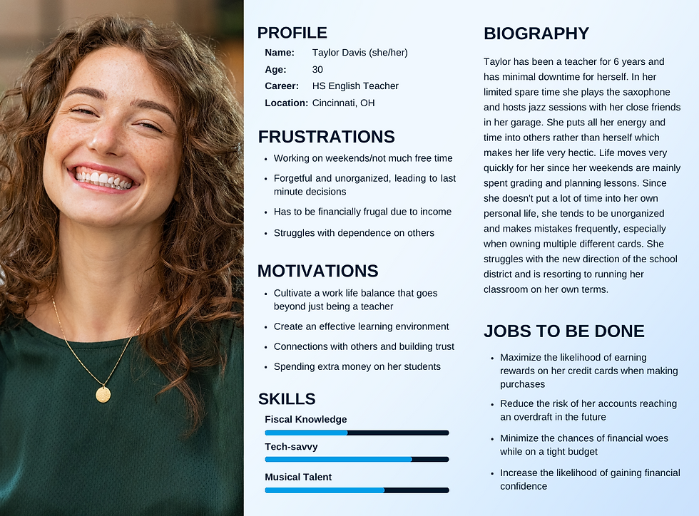
We then gathered our "jobs to be done" from Taylor. These included:
Maximizing the rewards on her cards
Reducing the risk of overdrafts, both now and in the future
Minimizing the chance of financial woes
Increasing her financial confidence
Using all that we had gathered thus far, we determined 3 potential user flows for us to build out and test. The first included the user receiving a lock screen notification to alert to a transaction that puts the user at risk of overdraft - in which they can then choose to reassign the transaction or not.

User Flow 1: Reassigning a transaction after receiving a notification.
The second flow included reassigning the transactions from the app's existing "Move Money" tab where users can look at their specific accounts and pending transactions without a notification.

User Flow 2: Reassigning a transaction via "Move Money" after the user realizes they need to use a different card.
Finally, the third flow allows users to reassign the transaction from within the account's pending transactions. The user would go into the card's pending transactions and switch the card from there.

User Flow 3: Reassigning a transaction from the transaction page after receiving an in-app notification.
As we conducted usability testing with prototypes designed in Figma, we found that while the majority of users completed the tasks with no issues, there was one issue that was sticking out. Our first and third flows were far too similar and confusing. One participant even asked, "When do you use this one but not the other?" To add to the confusion, there was a button within a button. Due to these concerns, we did a complete redesign of the difficult task and combined the first and third flows into one - which carried over to our final designs. The screen pictured is the culprit of the confusion. This same screen was in both the first and third flow, yet led to two different screens depending on the task. After completing the redesign, we did more user testing where we found that with this new design, users were able to complete both tasks quickly and efficiently while enjoying their experience with the app and feature. |  |
Interactive Prototype - Final Deliverables
Flow 1: Reassign a transaction from the transaction page after receiving an alert
In this flow, users receive a notification. Upon opening the app, they find a notification under the account with the recent transaction that puts them at risk. Upon opening the account page, they find an alert under the transaction that puts them at risk.


After selecting the transaction and the account they wish to transfer it to, the user will be taken to a confirmation page to confirm the reassignment. The user will be prompted to return to the home screen where the alert will be gone.
Flow 2: Reassign a transaction through the "Move Money" tab
In this flow the user does not receive a notification about a transaction, but instead realizes on their own they put a transaction on a card other than the one they wish to have used. After navigating to the "Move Money" tab and selecting "Reassign Transaction", the user will be prompted to select the account they would like to reassign the transaction(s) from. They can view the pending transaction(s) on that card where they can then choose which transaction(s) to reassign.


Then, like the first flow, the user will select the account to transfer each transaction to, confirm the reassignment, and receive confirmation that the reassignment has been completed.
Value for Taylor
Before the reassigning transactions feature, Taylor is scared. She used the wrong card on a purchase and now she is going to overdraft. She is trying to find a way to remedy the situation, looking at her bank's website, reaching out to them, and ultimately determining her best course of action is to plan how to solve the problem when her next paycheck comes in because there isn't much else she can do right now. She's panicking and stressed.
Now, with the reassigning transactions feature, Taylor uses the wrong card and panics for a second before remembering she is safe because her bank has her back. She opens her banking app on her phone, reassigns the transaction to another card, and takes a sigh of relief knowing that she is ok. She feels safe and secure.
Conclusion
Through this project, I was able to have a real-life experience using everything throughout my education. I learned throughout the project, including how UX/UI design practices are put to use in a "real world situation". We worked through a multitude of obstacles, from not even knowing where to start, to needing to completely pivot our thinking, to having a design that didn't work well. Ultimately, despite these obstacles, we were able to create a design that provides a great experience for users and is something that our team takes great pride in.
If you would like to see more images and more of the process from this project, please reach out and I will be happy to provide more!